
Your Painting Journey: From Beginner to Confident Artist
First 3 Months
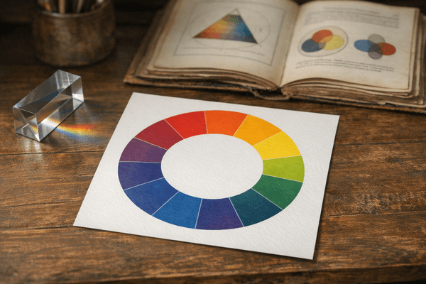
Stage 1: Understanding the Basics
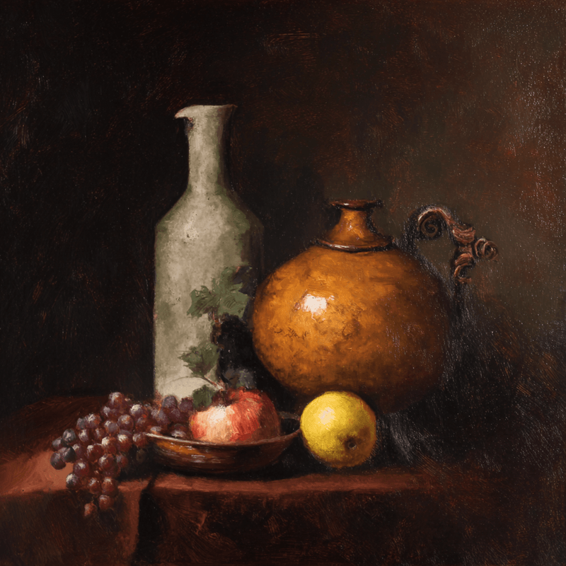
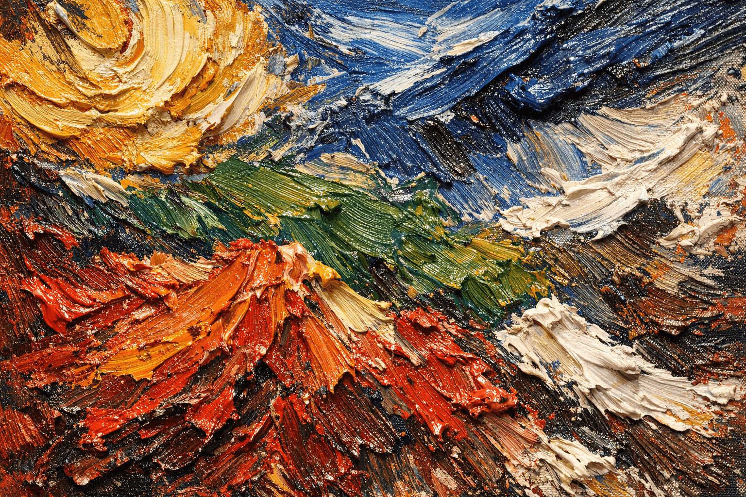
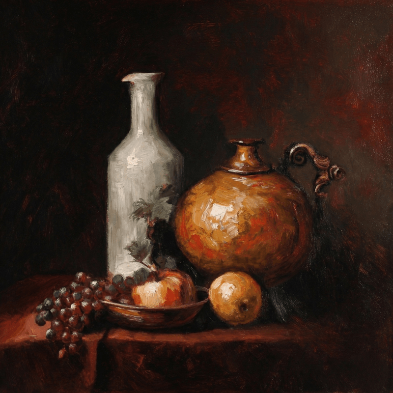
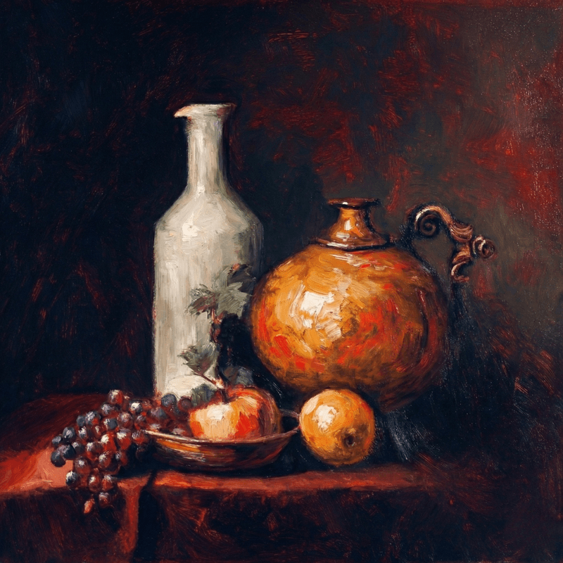
Master the fundamentals through still life studies
Your first three months focus on fundamentals: how paint behaves, basic color relationships, and simple techniques. Expect frustration as your hands learn new motor skills and your eyes learn to see color relationships. This is normal and necessary. During this stage, focus on small studies rather than ambitious finished paintings. Practice mixing clean secondary colors, achieving consistent paint consistency, and controlling your brush.
Common milestones: Successfully mixing a specific color on your first try, completing your first painting that doesn't look muddy, understanding why a color doesn't match your reference (too warm, too light, wrong saturation). These small victories build the confidence needed for the next stage. Our introduction to oil painting basics provides structured exercises for this foundational period.
Key Milestones
- Mix specific colors accurately
- Complete first non-muddy painting
- Understand color temperature
Months 3-6
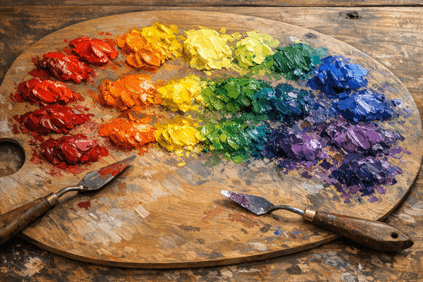
Stage 2: Controlled Exercises
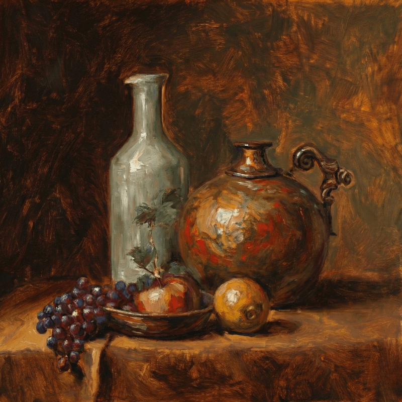
Practicing controlled exercises with limited palettes
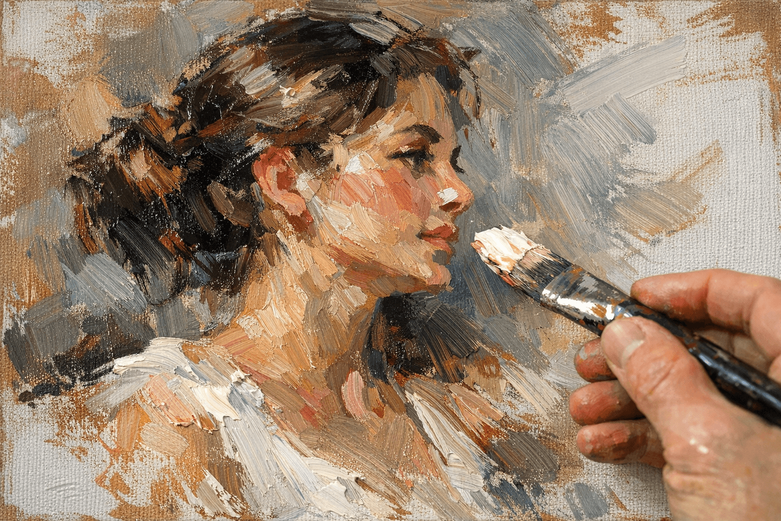
After basics feel comfortable, move to deliberate practice with constraints. Paint the same subject (like an apple) multiple times using different limited palettes. Try the Zorn palette (yellow ochre, vermillion, ivory black, white) for portraits. Attempt alla prima (wet-on-wet) techniques for small landscapes. These controlled exercises teach you what different approaches can achieve.
This stage develops your problem-solving abilities. When colors don't work, you'll start diagnosing why: "This green is too warm" or "I need more value contrast, not different hues." You're building an internal database of cause-and-effect relationships. Expect to produce some unsuccessful paintings—these teach you more than successes. The key insight from common painting mistakes is that every error is data for improvement.
Key Milestones
- Diagnose color problems
- Use limited palettes effectively
- Learn from unsuccessful paintings
Months 6-12
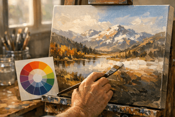
Stage 3: Building Confidence
Building confidence through creative color choices
Around six months, technical struggles decrease and creative challenges increase. Your hands can execute what your mind envisions, but now you're wrestling with composition, storytelling, and personal expression. Color mastery becomes about supporting your artistic intent rather than just matching what you see.
You'll start making deliberate choices to adjust colors for emotional effect: cooling shadows for a melancholy mood, warming highlights for golden hour nostalgia, exaggerating saturation for vibrancy. This is where you transition from technician to artist. The confidence to depart from strict realism comes from thoroughly understanding the reality you're departing from.
Year 2 and Beyond
Stage 4: Developing Personal Style
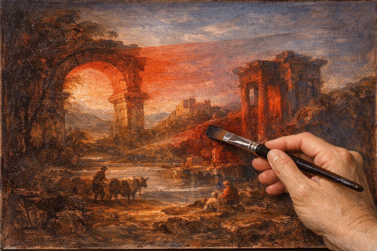
Developing unique artistic style and color signature
After a year of consistent practice, recognizable patterns emerge in your work. Perhaps you gravitate toward muted earth tones or favor high-key, light-filled scenes. Maybe you use distinctive mark-making or characteristic color combinations. This personal style develops naturally from your accumulated decisions and preferences—it cannot be forced earlier.
At this stage, color becomes one tool among many for expressing your unique artistic vision. You might develop signature approaches: always using a colored ground, favoring optical mixing over pre-mixed colors, or building paintings through successive glazes. Our advanced landscape techniques tutorial explores how experienced painters use color sophistication to create impact.
Stage 5: Realistic Expectations and Practice Routines
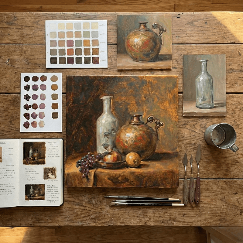
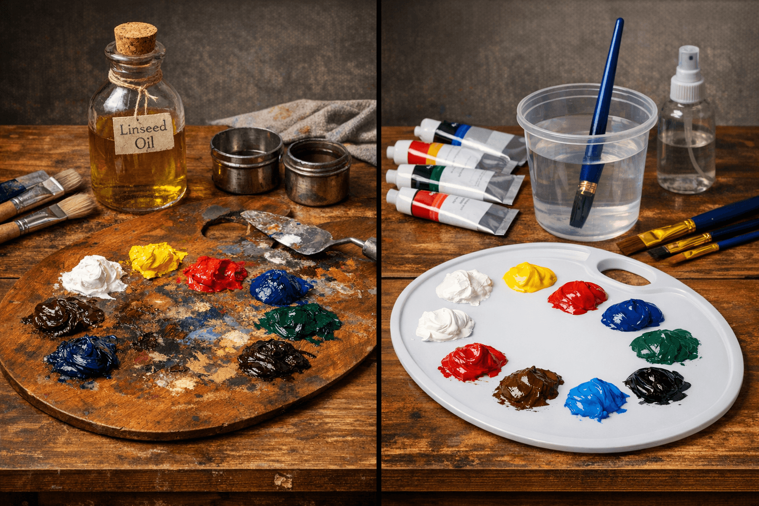
Effective practice routines for color mastery
Progress isn't linear. Expect plateaus where you seem stuck, followed by breakthroughs where everything suddenly clicks. Most painters need 100-200 hours of practice (about a year of painting 3 hours per week) to feel genuinely confident with color mixing. This timeline assumes deliberate practice, not just recreational painting.
Effective practice: Paint small color studies before large paintings. Copy master works to understand their color strategies. Paint the same subject repeatedly to isolate specific skill development. Mix color charts to build your mental library. Keep a painting journal documenting what worked and what didn't. These habits, detailed in our educational content, accelerate your journey from beginner to confident artist.