Mastering Color Theory for Oil Painters: A Deep Dive for Beginners
Below is an in‐depth tutorial focused exclusively on color theory as it applies to oil painting. This guide delves into the science behind color, the nuances of pigment mixing, and practical techniques—all tailored for beginners eager to master the interplay of hues in their work.
Skip color theory—get your oil paint palette & mixing recipes now!
✨ Select your reference image and get an instant oil paint color palette with precise mixing recipes. 🎨
Get your oil paint color palette now1. The Science of Color: Light, Pigments, and Perception
In the world of oil painting, a deep understanding of color theory is crucial to create artwork that is both vibrant and balanced. The very foundation of color lies in the physics of light and the chemistry of pigments. When light strikes an object, certain wavelengths are absorbed while others are reflected. Our eyes then perceive these reflected wavelengths as the object's color, a process that is essential to mastering pigment mixing and achieving the desired visual impact.
For beginners, grasping these core concepts not only demystifies how colors interact but also empowers you to experiment confidently on the canvas. By learning the science behind color, you gain insights into how to manipulate light and pigment properties to produce realistic and harmonious effects.
Key Concepts in Color Science
- Light and Wavelengths: Every color corresponds to a specific wavelength in the visible spectrum. For instance, blue light has a shorter wavelength compared to red light. This knowledge helps oil painters understand how colors will behave under different lighting conditions.
- Pigment Properties: In oil painting, pigments are finely ground particles suspended in oil. Their chemical composition determines important characteristics such as transparency, opacity, and how well they blend with other pigments. Understanding these properties is vital for successful color mixing.
- Perception and Context: Colors do not exist in isolation. The appearance of a color can change depending on the hues adjacent to it and the lighting environment. This contextual perception is a key element in creating depth and visual harmony in your artwork.
By mastering these principles, you can predict pigment behavior, blend colors seamlessly, and achieve a balanced composition that enhances the overall impact of your work. This scientific approach is the cornerstone for developing effective oil painting techniques that resonate with your audience.
2. Building Your Color Wheel: Primary, Secondary, and Tertiary Colors
In the exciting journey of oil painting, mastering your own color wheel is an essential step toward understanding and applying color theory. A well-constructed color wheel not only serves as a visual guide to color relationships but also deepens your insight into pigment mixing, helping you create balanced, dynamic, and harmonious compositions.
For a beginner oil painter, the process of building a color wheel is both an educational exercise and a creative exploration that lays the groundwork for all future projects. By delving into the various categories of colors, you will learn how to manipulate hues to create mood, depth, and contrast in your artwork.
Understanding the Basic Categories
The traditional color wheel is divided into three primary groups: primary, secondary, and tertiary colors. Each group plays a unique role in building a vibrant and effective palette:
Primary Colors
Primary colors form the backbone of your color palette. These colors cannot be produced by mixing other hues, and their inherent purity and vibrancy make them indispensable for creating bold and striking paintings.
- Red: Evokes passion and energy; often used to draw attention or create a dramatic focal point.
- Blue: Conveys calmness and depth; can be used to generate both serene and powerful effects.
- Yellow: Radiates warmth and brightness; perfect for highlighting and adding vitality to a composition.
Secondary Colors
Secondary colors emerge from mixing two primary colors, expanding your palette with transitional bridges between bold primary tones:
- Red + Yellow = Orange: A lively hue that infuses warmth and energy into your work.
- Blue + Yellow = Green: Evokes feelings of nature and calm, balancing intensity with tranquility.
- Red + Blue = Purple: A deep and regal color that adds a sense of mystery and sophistication.
Tertiary Colors
Tertiary colors emerge when mixing a primary color with an adjacent secondary color. These nuanced hues bring subtlety and refinement to your compositions, allowing for fine-tuned expression in your artwork.
Practical Exercise: Create Your Own Color Wheel
Engage in this practical exercise to consolidate your understanding:
- Step 1: Draw a large circle and divide it into equal segments.
- Step 2: Place primary colors at equidistant points.
- Step 3: Mix adjacent primary colors to create secondary colors.
- Step 4: Blend primary colors with neighboring secondary colors for tertiary hues.
- Step 5: Document your observations about color interactions and relationships.
3. Exploring Color Relationships in Depth
In oil painting, the way colors interact with one another is just as important as the colors themselves. The relationships between hues can dramatically influence the emotional tone and visual impact of your artwork. By understanding how to manipulate these relationships, you can create compositions that are not only aesthetically pleasing but also emotionally engaging. This section delves into the key color relationships—complementary, analogous, and triadic schemes—and explains how each can be effectively used in your oil paintings.
Complementary Colors
Complementary colors are located directly opposite each other on the color wheel. Classic examples include blue and orange or red and green. When used together, these colors create a strong visual contrast that intensifies their vibrancy. This dynamic interplay can draw the viewer's eye to focal points in your painting and add a sense of energy to the overall composition.
Key aspects of using complementary colors effectively include:
- Enhancing Vibrancy: The contrast between complementary hues can make each color appear more vivid, which is particularly useful when you want to emphasize certain elements of your painting.
- Balancing Warm and Cool Tones: Complementary pairs often include one warm and one cool color, allowing you to create a balanced temperature in your artwork. For instance, a cool blue paired with a warm orange can add depth and interest.
- Creating Dynamic Focal Points: When strategically applied, complementary colors can highlight the focal areas of your work, ensuring that the viewer's attention is drawn to the intended subjects.
- Managing Intensity: While the contrast can be striking, it's important to balance the intensity by adjusting the saturation or using variations like muted or pastel versions of complementary colors.
For beginners, experimenting with complementary color pairings can be an exciting way to learn how color contrasts work and how they can be adjusted to suit different moods and themes in your paintings.
Analogous Colors
Analogous colors are groups of three or more colors that sit side-by-side on the color wheel. Examples include combinations like blue, blue-green, and green. These color schemes naturally blend well together, creating a sense of harmony and unity in your work. Analogous color schemes are particularly effective for conveying a calm, serene atmosphere.
Consider these points when using analogous colors in your oil paintings:
- Creating Cohesion: Since analogous colors share a common hue, they work together seamlessly to form a unified and balanced composition.
- Smooth Transitions: The subtle gradations between analogous colors are ideal for creating smooth transitions, which can be especially useful in backgrounds or landscapes.
- Establishing Mood: The use of closely related colors can evoke specific emotional responses. For example, a palette of cool analogous colors can evoke feelings of tranquility, while a range of warm analogous colors can create a cozy or energetic feel.
- Flexibility in Application: Analogous schemes allow for variations in tone and intensity, giving you the flexibility to adjust the overall mood without disrupting the color harmony.
Triadic Color Schemes
A triadic color scheme involves the use of three colors that are evenly spaced around the color wheel. This approach is known for providing a balanced yet vibrant palette where each color contributes equally to the overall composition. Triadic schemes offer a harmonious blend of contrasts and similarities, making them a popular choice for creating dynamic and lively artworks.
Important aspects to consider when working with triadic color schemes include:
- Equilibrium: The even spacing of colors ensures that no single hue overwhelms the others, resulting in a balanced visual effect.
- Vibrancy with Control: Although triadic schemes are inherently colorful and energetic, careful control of saturation and value can prevent the composition from becoming too chaotic.
- Versatility: Triadic color schemes can be adapted to a wide range of subjects and styles, from abstract compositions to detailed landscapes, making them a versatile tool in your artistic repertoire.
- Enhanced Depth: Using a triadic scheme can add depth to your work, as the contrasting yet harmonious hues create layers of interest that engage the viewer's eye.
Practical Tips for Applying Color Relationships in Oil Painting
As you experiment with complementary, analogous, and triadic color schemes, keep these practical tips in mind to enhance your artwork:
- Start Small: Practice on small canvases or sketches before applying these techniques to larger, more complex works.
- Observe and Analyze: Study masterful paintings and note how renowned artists use color relationships to create impact. Analyze the balance between warm and cool tones, contrast, and harmony.
- Experiment with Mixing: Use your color wheel as a reference for mixing pigments. Observe how slight changes in proportions can affect the final hue and intensity.
- Layer and Glaze: In oil painting, layering and glazing can modify how colors interact. Experiment with translucent layers to create depth and alter the vibrancy of complementary or analogous colors.
- Keep a Color Journal: Document your experiments with color relationships. Record your mixing ratios, the effects of various pairings, and any observations about mood or impact. This will serve as a valuable reference as you continue to develop your skills.
Understanding and mastering the interplay of complementary, analogous, and triadic color schemes is a transformative step for any beginner oil painter. As you experiment with these color relationships, you will not only enhance the technical quality of your paintings but also unlock new levels of emotional expression and visual storytelling.
4. Techniques for Harmonious Color Mixing in Oil Painting
Oil painting is celebrated for its rich blendability, forgiving nature, and the slow drying time that allows for meticulous manipulation of hues. These unique qualities empower you, as a beginner, to explore the endless possibilities of harmonious color mixing through various techniques. Whether you are gradually adjusting tones or building complex layers of transparent glazes, mastering these techniques is essential for creating artwork that is both vibrant and emotionally engaging.
In this comprehensive guide, we will dive deep into several key techniques: incremental blending, glazing and layering, and understanding the nuances of pigment bias. Each method not only enhances your technical skills but also provides valuable insight into the interplay of light, pigment, and texture that is fundamental to oil painting.
Incremental Blending: A Step-by-Step Approach
Incremental blending is a fundamental technique in oil painting that involves the gradual addition of small amounts of a secondary or complementary hue to an existing base color. This method is particularly useful for achieving smooth transitions and subtle shifts in color intensity without overwhelming the canvas.
As you work incrementally, you start with a pure color and then, over several stages, carefully blend in another hue. This controlled process allows you to monitor the evolution of the color, ensuring that each addition contributes to a balanced and harmonious mixture. For instance, when you add a hint of blue to a predominantly red area, you can observe how the overall tone shifts towards purple, enabling you to fine-tune the balance between vibrancy and subtlety.
This technique is not just about mixing colors; it's a lesson in precision and patience. With incremental blending, you learn to appreciate the delicate balance required to achieve the desired hue and saturation. It also offers the advantage of correcting mistakes gradually, making it an excellent method for beginners who are still developing their confidence and control.
Glazing and Layering for Depth and Luminosity
The techniques of glazing and layering are powerful tools in the oil painter's repertoire, thanks to the medium's ability to remain workable over time. Glazing involves applying thin, transparent layers of paint over a dried underlayer. This method allows the underpainting to subtly influence the final appearance, creating a luminous effect that can bring out hidden depths and complex color interactions.
Layering, on the other hand, refers to the gradual build-up of colors by applying successive layers. Each layer contributes to the overall texture and vibrancy of the piece, and because oil paints take time to dry, you can control the way each new layer interacts with the previous ones. This process can result in paintings with a rich, almost three-dimensional quality, where the interplay of light and shadow becomes a central feature.
By mastering these techniques, you can create intricate effects such as:
- Enhanced Depth: The transparent quality of glazes creates an illusion of depth, as light passes through multiple layers, reflecting off the underlying colors.
- Subtle Color Modulation: Layering enables you to adjust the intensity and hue gradually, resulting in a more refined and complex color palette.
- Dynamic Texture: Combining different layers can lead to a tactile surface that adds interest and dimension to your work.
Both glazing and layering require a strategic approach and a careful understanding of timing and drying periods. Experiment with these techniques on smaller canvases or studies before applying them to larger works. This practice will help you gain a more intuitive sense of how each layer contributes to the overall composition.
Understanding Pigment Bias for Accurate Color Mixing
Every pigment in your oil paint set has its own unique properties, including what is known as pigment bias. This refers to the inherent tendency of a pigment to lean towards either a warm or cool tone, even if it is labeled as a particular color. For example, two different reds may have different underlying hues—one may have a warm, orange bias while the other may be cooler, with hints of blue.
Understanding pigment bias is crucial because it affects how colors interact when mixed. When blending pigments, these subtle differences can result in variations in hue, saturation, and overall intensity. Experimenting in small batches is essential to learn how each pigment behaves. By noting the characteristics of each color and observing how they mix, you develop a more predictable approach to achieving the desired outcomes in your paintings.
Integrating Techniques for a Cohesive Approach
While each of these techniques offers its own benefits, the true power of oil painting lies in integrating them to create a cohesive approach to color mixing. As a beginner, it can be immensely helpful to view these techniques as interconnected tools rather than isolated methods.
For example, you might start a painting with incremental blending to establish a smooth gradient in the background. Once the base is established, you could use glazing to add luminous accents and enhance the depth of certain areas. Finally, by paying attention to pigment bias throughout your process, you can fine-tune your mixtures to ensure that the colors remain balanced and true to your artistic vision.
Practical Tips and Exercises for Beginners
To truly master these techniques, practical application is key. Begin by setting up a dedicated workspace where you can experiment freely with small samples of oil paint. Use a palette to test different mixing ratios and record your observations in a color journal. Note how incremental changes affect the hue and how different layers interact once dry. This journal will become an invaluable reference as you progress.
Take the time to analyze the work of master oil painters. Study their layering techniques, observe how they manage light and color transitions, and consider how pigment bias might have influenced their choices. By integrating these observations into your practice, you can begin to develop your own approach to harmonious color mixing that reflects both technical skill and creative intuition.
5. Manipulating Saturation, Value, and Temperature
Mastering the control of saturation, value, and temperature is a cornerstone of effective oil painting that can transform your artwork from flat to dynamic. These three critical elements of color manipulation not only help you set the mood and atmosphere but also play a vital role in defining form, depth, and visual interest. For a beginner, understanding how to adjust these parameters can elevate your paintings by enhancing realism and emotional impact.
This section will guide you through the nuanced concepts behind each element and provide practical tips on how to experiment and incorporate these adjustments into your creative process.
Saturation
Saturation refers to the intensity or purity of a color. A highly saturated color is vivid and bold, while a desaturated color appears more muted or grayish. Manipulating saturation is essential for controlling the visual impact of a painting. For example, highly saturated colors can make a subject pop, drawing the viewer's attention, whereas muted hues are often used to create atmospheric backgrounds or to evoke a more subdued mood.
There are several methods to adjust saturation:
You can reduce saturation by mixing in a complementary hue or a neutral tone. This process softens the intensity of the color, making it ideal for creating depth in landscapes or for gently transitioning between different areas of your composition. By practicing these techniques, you will learn how to balance vibrant focal points with more subtle, atmospheric elements.
Experiment with your palette by creating swatches of colors at varying saturation levels. Observe how each adjustment affects the emotional tone and overall harmony of your painting. This hands-on experience is invaluable for building confidence and understanding in how saturation can be manipulated to suit your artistic vision.
Value
Value defines the lightness or darkness of a color, which is crucial for establishing contrast and dimensionality in your work. Adjusting value allows you to create the illusion of light and shadow, contributing significantly to the perception of depth and form in a painting.
One common way to modify value is by creating tints and shades:
To create a tint, mix the color with white, which lightens the hue and is often used to depict areas illuminated by light or to bring a sense of airiness to your work. Conversely, adding black or a darker complementary tone results in a shade, deepening the color to evoke shadows and enhance the three-dimensionality of objects.
Understanding value is essential for beginners because it affects how elements within a painting interact. For example, a gradual transition from light to dark can define the curvature of an object, while stark contrasts in value can create dramatic focal points. Practice by painting simple forms, such as spheres or cylinders, using a range of tints and shades to get a feel for how value influences perception.
Temperature
Temperature in art refers to the perceived warmth or coolness of a color, which can drastically alter the mood of a painting. Warm colors such as reds, oranges, and yellows typically evoke feelings of energy, passion, and intimacy. In contrast, cool colors like blues, greens, and violets are often associated with calmness, tranquility, and distance.
Balancing warm and cool tones is key to creating a painting that feels both balanced and dynamic. For instance, using warm tones in the foreground can make a subject feel closer and more inviting, while cooler hues in the background can create a sense of receding space and calm.
Beginners should experiment by creating small studies that emphasize either warm or cool palettes. Observe how a slight shift in temperature can change the entire mood of a scene. This experimentation will build an intuitive understanding of how temperature interacts with other elements like value and saturation, enriching your overall approach to color theory.
Integrating Saturation, Value, and Temperature for Dynamic Artwork
When used together, saturation, value, and temperature are powerful tools for conveying depth, mood, and atmosphere. Here are some practical ways to integrate these elements into your oil painting process:
Start by developing a series of color studies where you adjust one element at a time. Create a gradient of a single color by varying its saturation, then experiment with altering its value by adding white or black. Next, try modifying the temperature by integrating a slight hint of a warm or cool hue. Such exercises will help you understand the subtle differences that each element brings to your work.
In a complete composition, you might use highly saturated colors in areas you wish to emphasize, while using desaturated tones to recede into the background. Similarly, strategic adjustments in value can define the contours and volume of your subject matter, while a balanced interplay of warm and cool tones can enhance the overall harmony and emotional impact of your painting.
For example, consider painting a landscape where the foreground features warm, vivid hues to draw attention, and the background employs cooler, more muted tones to suggest atmospheric perspective. Experiment with these contrasts, observing how they contribute to the narrative and depth of your scene.
In conclusion, mastering the manipulation of saturation, value, and temperature is a critical skill for any beginner oil painter. These elements are not just technical aspects of color theory; they are the keys to expressing emotion, creating depth, and establishing a compelling visual narrative in your work. By dedicating time to understand and experiment with these techniques, you will develop a more refined and intuitive approach to painting.
6. Developing Your Personal Palette Through Experimentation
Creating a personal palette is a dynamic and essential process for every beginner in oil painting. This journey goes far beyond simply choosing a set of colors—it's about discovering the perfect blend of hues that resonate with your creative vision and style. A well-developed palette reflects your understanding of color theory and serves as a practical record of your experimentation with pigment mixing.
Starting with Core Hues and Complementary Shades
Begin by selecting a few core hues that will form the backbone of your palette. These typically include the primary colors (red, blue, and yellow), which are essential for creating a wide range of other colors. Complement these with carefully chosen secondary and complementary shades that add contrast and balance to your mixes.
As you experiment, observe how different pigments interact. For example, you might discover that one version of red has a warmer bias while another leans cooler, dramatically influencing how they mix with other colors. This stage is all about exploration—testing various combinations to see what truly sparks your creative expression.
Recording Your Mixing Ratios and Observations
A key part of developing your personal palette is documenting your experiments. Keep a detailed journal or digital log where you record the exact mixing ratios, the pigments used, and your observations about the resulting hues. Note any surprises, adjustments, or particular combinations that stand out.
This record not only helps you replicate successful mixtures in future projects but also allows you to track your progress as you learn more about the behavior of different pigments. Over time, your notes will become a valuable reference, guiding you in achieving consistent and refined color mixtures.
Experimenting on Scrap Canvases and Palette Paper
Before committing your ideas to a final piece, use scrap canvases or palette paper as testing grounds for your color experiments. These low-stakes practice sessions allow you to experiment freely, refine your techniques, and see firsthand how your chosen colors interact under various conditions.
Experiment with different techniques such as incremental blending, glazing, and layering. This hands-on approach enables you to understand the nuances of each method and how they affect your overall palette. As you work through these tests, you'll build confidence and gain a clearer idea of which color combinations best express your artistic vision.
Evolving Your Palette with Your Technique and Personal Style
Your personal palette is not static—it evolves alongside your skills and artistic style. As you become more comfortable with oil painting techniques and deepen your understanding of color relationships, your palette should reflect this growth. Incorporate new colors, adjust existing mixtures, and continually refine your choices to match your evolving style.
This evolutionary process allows your palette to serve as a living document of your artistic journey. Each experiment, each recorded observation, and every refined color mix contributes to a signature set of hues that is uniquely yours. Over time, this palette will not only guide your work but also become a representation of your creative identity.
Practical Tips for Building and Refining Your Palette
Here are some actionable tips to help you develop a robust personal palette:
- Start Small: Limit your initial palette to a few core colors and gradually expand as your confidence and skills grow.
- Document Everything: Use a dedicated journal or digital app to note your mixing ratios, pigment behaviors, and personal observations.
- Experiment Often: Regularly use scrap canvases or palette paper to test new combinations and techniques without the pressure of a final piece.
- Review and Revise: Periodically revisit your recorded experiments to refine your palette, adapting it to your evolving artistic style.
- Learn from Others: Study the palettes of master oil painters and incorporate elements that resonate with your creative vision.
By following these tips, you will build a personal palette that not only enhances your current projects but also documents your growth as an artist. This evolving record will be an invaluable resource as you continue to explore the vast possibilities of oil painting and color mixing.
In conclusion, developing your personal palette through experimentation is a vital part of your journey as a beginner oil painter. It is an ongoing process of exploration, documentation, and refinement that ultimately shapes your creative identity. Embrace this process, and allow your palette to evolve as a living testament to your artistic growth and mastery of color theory.
7. Practical Exercises to Deepen Your Color Intuition
Regular practice is key to truly internalizing the principles of color theory and enhancing your oil painting skills. Engaging in targeted exercises not only solidifies your understanding but also builds confidence in your ability to manipulate hues, saturation, value, and temperature. Below, you'll find a series of practical exercises designed to deepen your color intuition and improve your overall technique.
Create a Detailed Color Wheel
Go beyond simply filling in a circle with basic colors. Instead, focus on meticulously mixing incremental variations between primary, secondary, and tertiary colors. This exercise encourages you to:
- Explore Subtle Gradations: Experiment with small adjustments in mixing ratios to create smooth transitions and delicate gradations between hues.
- Understand Color Relationships: Observe how minor changes can shift a color's intensity and temperature, and learn how these shifts affect overall harmony.
- Document Your Process: Keep a detailed record of your mixing experiments to serve as a reference for future projects.
By creating a comprehensive and nuanced color wheel, you'll develop a better grasp of the intricate relationships between different hues, ultimately strengthening your ability to choose and mix colors effectively.
Complementary Pair Studies
Complementary colors, which are opposite each other on the color wheel, can be used to create dynamic contrasts. In this exercise, create a series of small studies using complementary color pairs. Focus on:
- Balancing Vibrancy and Subtlety: Experiment with varying ratios of each color to see how the contrast shifts from bold and energetic to harmonious and muted.
- Enhancing Focal Points: Use complementary pairs to practice drawing attention to specific areas within your compositions, learning how contrast can guide the viewer's eye.
- Testing Color Interactions: Document how different pigments interact when paired together, noting any unexpected outcomes or unique blends.
This exercise will sharpen your eye for color contrasts and teach you how to use complementary pairs to add depth and vibrancy to your paintings.
Tonal Gradation Charts
Tonal gradation charts are an excellent way to explore the subtleties of value in color. For this exercise, select a single hue and gradually add white to create a series of tints, or add black to develop a series of shades. Focus on:
- Observing Subtle Shifts: Pay close attention to how the hue changes as you lighten or darken it, and note the gradual transformation in mood and intensity.
- Understanding Light and Shadow: Use your charts to simulate how light interacts with objects, helping you to visualize depth and form in your future compositions.
- Experimenting with Consistency: Work on maintaining consistent mixing techniques to ensure smooth transitions across the chart, which is key for creating realistic textures and gradients.
These charts serve as a practical reference that you can return to when planning the value dynamics in your paintings, ensuring that your work has the necessary depth and visual interest.
By regularly engaging in these exercises, you will develop a keen intuition for color mixing and gain a deeper understanding of how different elements of color interact. This hands-on practice is invaluable for building the skills necessary to create compelling, harmonious oil paintings.
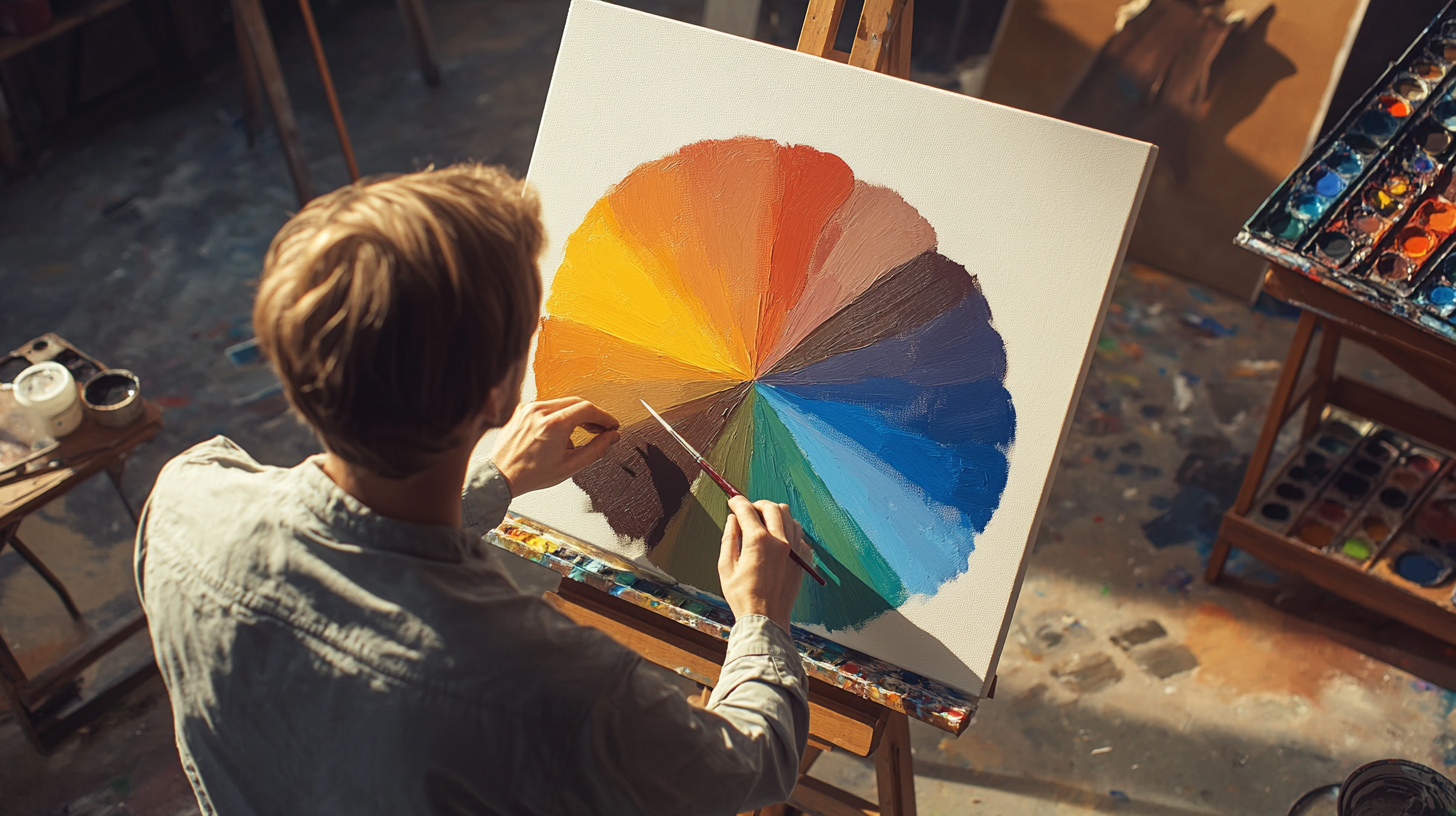
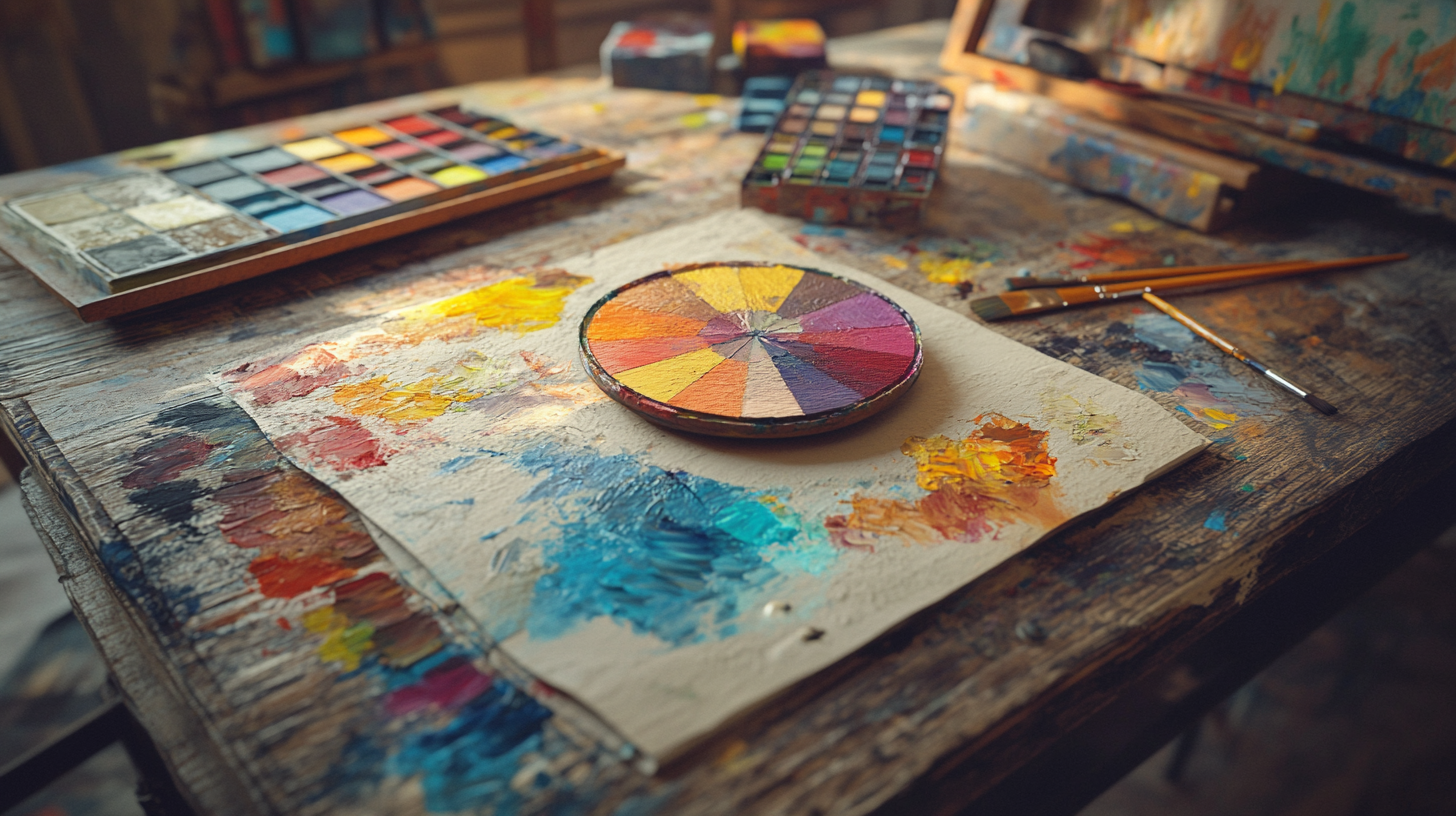
Below is a photorealistic image that captures a well-organized workspace featuring a detailed color wheel, complementary pair studies, and tonal gradation charts. The image highlights the practical tools and detailed records that serve as the backbone for deepening your color intuition in oil painting:
8. Avoiding Common Pitfalls in Color Mixing
Even with a solid understanding of color theory, mistakes in color mixing can still occur. Recognizing common pitfalls and knowing how to fix them is essential for any beginner oil painter. In this section, we will explore three frequent issues—over-blending, misjudging pigment interactions, and ignoring context—and provide actionable tips on how to correct these mistakes.
Over-Blending
Over-blending happens when colors are mixed too thoroughly, resulting in a loss of vibrancy and texture. This excessive blending can make your work look flat and lifeless, as the distinct qualities of each color get lost in a uniform mixture.
How to Fix Over-Blending:
- Maintain Texture: Use techniques such as impasto to apply thicker layers of paint, preserving visible brush strokes and texture.
- Work Wet-on-Wet Strategically: Blend only in areas that require a smooth transition. Leave other sections with more defined strokes to retain dynamic energy.
- Layer Gradually: Instead of blending colors entirely on the palette, apply them in separate layers on the canvas. This method, similar to glazing, keeps each color distinct while still achieving harmonious transitions.
- Step Back Regularly: Periodically step back from your work to evaluate the overall balance. If you notice the colors are too muted, reintroduce fresh, unblended strokes to restore vibrancy.
Misjudging Pigment Interactions
Not all pigments mix harmoniously. Some combinations may result in muddy or dull colors, especially when pigments with strong biases interact. This misjudgment can lead to unexpected outcomes that derail your intended color scheme.
How to Fix Misjudging Pigment Interactions:
- Test Small Batches: Always experiment with small quantities of color before committing to a large area. This will help you see how pigments interact without wasting materials.
- Learn Pigment Properties: Familiarize yourself with the characteristics and biases (warm or cool) of the pigments in your palette. Knowing these properties will guide you in choosing compatible colors.
- Adjust Ratios Gradually: If a mixture turns out muddy, slowly adjust the proportions. Sometimes, adding a little more of one pigment or a small amount of a complementary color can brighten the mixture.
- Explore Alternative Combinations: If a particular pairing consistently produces unsatisfactory results, consider substituting one of the colors with a similar hue that behaves better in mixtures.
Ignoring Context
A color that looks perfect on your palette or in isolation might behave very differently when applied to an entire canvas. The interaction with surrounding colors, the underlying underpainting, and the ambient light can all influence how a color is perceived.
How to Fix Ignoring Context:
- Test In Situ: Always apply your mixed colors to a small section of your actual canvas or a similar test surface to see how they interact with other elements of your composition.
- Consider the Overall Composition: Evaluate your color choices within the context of your painting's theme and background. Adjust the mixture based on how it complements or contrasts with nearby colors.
- Use Underpainting: Establish a tonal foundation or underpainting first. This helps you see how your colors work together and gives you a better sense of their final appearance.
- Review in Various Lighting Conditions: Colors can shift dramatically under different lighting. Examine your test mixtures in both natural and artificial light to ensure consistency and balance in your final piece.
By being aware of these common pitfalls and employing practical techniques to correct them, you can enhance the clarity and vibrancy of your color mixtures. Avoiding over-blending, testing pigment interactions carefully, and evaluating colors within the full context of your work are key strategies that will help you achieve more dynamic, balanced oil paintings.
9. Conclusion: Evolving Your Color Mastery
Color theory is not a static set of rules but a dynamic framework that deepens with experience. As you continue your journey in oil painting, every brushstroke becomes a testament to your growing understanding of pigments, hue relationships, and advanced mixing techniques. This process of exploration and constant learning is what transforms a simple canvas into a powerful expression of emotion and depth.
Reflect on Your Artistic Journey
Take a moment to appreciate your progress. Each exercise, every experiment with incremental blending, and all your studies of masterworks contribute to your evolving mastery of color. Your commitment to understanding the nuances of color theory not only enhances your technical skills but also deepens your ability to express feelings and tell stories through your artwork.
Next Steps for Continuous Growth
The path to refining your color mastery is ongoing. Here are some actionable next steps to further elevate your skills and broaden your artistic horizons:
- Keep Experimenting: Regular experimentation with new techniques and color combinations will solidify your grasp of pigment mixing and help you develop a unique style. Embrace each mistake as a learning opportunity.
- Study Masterworks: Dive into the world of renowned oil painters. Analyze how they utilize color to create depth and evoke emotion. Observe their layering, use of light, and dynamic contrasts to inspire new ideas for your own work.
- Engage with Fellow Artists: Connect with other artists through workshops, online forums, or local art groups. Sharing your work and receiving constructive feedback can provide fresh perspectives and stimulate creative growth.
- Keep a Creative Journal: Document your experiments, mixing ratios, and observations. This personal log will not only help you track your progress but also serve as an invaluable reference for future projects.
- Set New Challenges: Constantly challenge yourself with new projects. Each painting is a chance to push your boundaries, experiment with advanced techniques, and further refine your color palette.
Remember, every painting you create is an opportunity to evolve your technique and express your unique artistic voice. Embrace the journey of continuous learning and enjoy the vibrant exploration of color that lies ahead. As you grow, your work will not only reflect your technical improvements but also your deepening connection with the art of oil painting.
Recommended Reading for Further Inspiration
To further deepen your understanding of color theory and enhance your oil painting techniques, consider exploring these highly recommended books available on Amazon:
- Color and Light: A Guide for the Realist Painter by James Gurney – A comprehensive resource that demystifies the interplay of light and color, offering practical techniques to help you create vibrant, realistic paintings.
- Interaction of Color by Josef Albers – A classic text that delves into the complexities of color perception and the dynamic relationships between hues, providing timeless insights that are essential for any oil painter.
- The Elements of Color: A Treatise on the Color System of Johannes Itten by Johannes Itten – This foundational book breaks down the principles of color theory, offering practical guidance for achieving balanced and harmonious compositions in your paintings.
These books serve as excellent companions on your artistic journey, offering both technical knowledge and creative inspiration to help you further refine your color mastery.