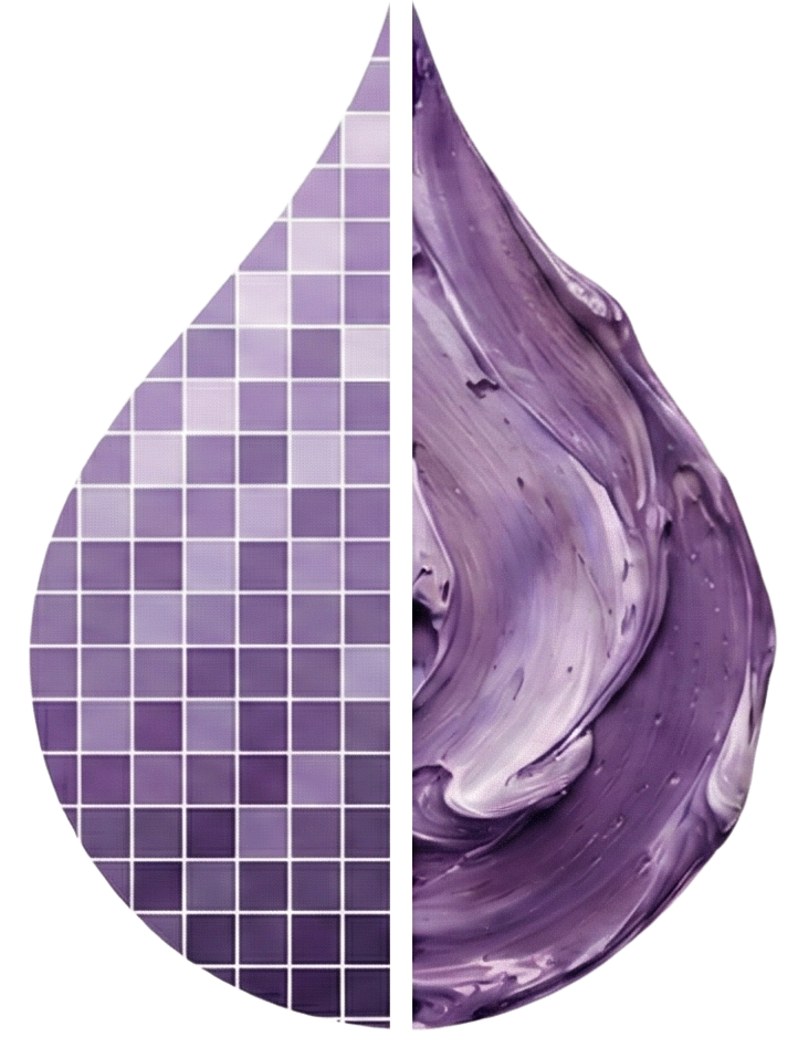
Achieving Harmony in Oil Paintings through Color
Color is the language of visual art, and when mastered, it can evoke deep emotions, create unity, and offer a feast for the eyes. Understanding the intricacies of color harmony in oil painting is essential for any artist looking to elevate their work. With the right approach to mixing harmonious colors, you can transform a simple canvas into a captivating masterpiece.
In this article, we will explore the fundamentals of achieving color harmony in your oil paintings. We will begin with the essential concept of understanding color harmony, where you'll learn how colors interact with each other, creating moods and perceptions. Next, we will delve into mixing analogous and triadic colors. You’ll discover how these color schemes can produce stunning compositions that captivate viewers and bring your artwork to life.
Furthermore, we will address the critical aspect of balancing colors in painting by examining how to create cohesive artworks that draw the eye without overwhelming it. Finally, we will introduce you to innovative AI tools for color harmony, specifically how color2oilpaint.com can assist you in selecting the perfect palette for your pieces. This platform is designed to make your journey towards creating balanced and sophisticated color schemes not only easier but more enjoyable as well.
By the end of this article, you’ll be equipped with practical techniques and insights essential for refining your approach to oil painting. Let’s embark on this colorful journey to achieve visual harmony in your artwork!
Understanding Color Harmony
At the core of creating visually stunning oil paintings lies the concept of color harmony. So what exactly do we mean by this term? Color harmony refers to the arrangement of colors in a way that is pleasing to the eye, establishing a sense of balance and unity within your artwork. For an artist, understanding color harmony in oil painting is not merely a theoretical exercise; it is a practical framework that guides the selection and mixing of colors to create a cohesive and impactful composition.
Color harmony is built upon the relationships that colors have with one another. Consider the color wheel, a vital tool in any artist's palette. By studying this tool, artists can gain insights into how colors interact. For instance, complementary colors—those that lie directly opposite each other on the wheel—create dynamic contrasts, drawing attention and energizing a composition. However, while these can be exciting, they should be used judiciously, as they can also lead to overwhelming results if not balanced appropriately.
On the other hand, we have analogous color schemes in oil, which involve selecting colors that are adjacent to each other on the color wheel. These colors work harmoniously together, creating serene and visually appealing transitions. For example, using a palette of yellow, yellow-orange, and orange can transport a viewer to a vibrant sunset without overtly jarring the senses. When mixing harmonious colors, aim for variations in lightness and saturation to add depth and dimension to your work, allowing the colors to resonate together.
A crucial aspect of color harmony is balancing colors in painting. This process involves not only choosing a palette that complements your vision but also understanding the proportions in which those colors are used. A painting overloaded with a single hue can create visual fatigue. Therefore, consider the '60-30-10 rule' as a guideline: allocate 60% of your canvas to a dominant color, 30% to a secondary color, and 10% to an accent color. This arrangement encourages a well-rounded composition where all colors share the spotlight without overwhelming the viewer.
Incorporating color temperature is another technique that can elevate your understanding of color harmony. Warm colors (reds, yellows, oranges) tend to advance in a composition, while cool colors (blues, greens, purples) recede. Use these principles strategically to create depth in your oil paintings. For example, a warm foreground combined with cooler backgrounds can enhance the perception of space and draw the viewer's eye toward the focal points of your artwork.
The advent of technology has also introduced exciting innovations for artists seeking to improve their color harmony skills. AI tools for color harmony, such as color2oilpaint.com, provide invaluable assistance in selecting palettes for your paintings. These tools can generate suggestions based on your chosen color or theme, offering a fresh perspective and making the process of mixing harmonious colors more accessible and efficient. By utilizing such resources, artists can experiment with different combinations, allowing for a deeper exploration of color relationships.
In conclusion, achieving color harmony in your oil paintings involves a multifaceted understanding of color relationships, thoughtful mixing, and an awareness of balance. It invites you to explore palettes that resonate with your artistic vision while ensuring unity across your pieces. By committing to these techniques, you will not only enrich your creative practice but also produce artworks that resonate with viewers, inviting them to experience the world as you see it.
Mixing Analogous and Triadic Colors
In the realm of color harmony in oil painting, mixing colors thoughtfully is key to achieving compositions that resonate deeply with your audience. Two compelling strategies for blending colors effectively are the use of analogous color schemes in oil and triadic color schemes. These techniques not only enhance the visual appeal of your paintings but also contribute to the emotional experience of the viewer.
Understanding Analogous Color Schemes
Analogous colors are those that sit next to each other on the color wheel—think of combinations like blue, blue-green, and green, or red, red-orange, and orange. When you select analogous colors for your palette, you create a soothing visual experience that reflects harmony and unity. This scheme is particularly effective in portraying natural scenes, such as a serene landscape at dawn or sunset.
To mix harmonious colors with an analogous palette, start by choosing one dominant color and then incorporate its neighboring hues. For example, if you select green as your base, consider introducing yellow-green and blue-green to create a rich, layered effect. When painting, make sure to vary the saturation and lightness of these colors to add depth and dimension—darker shades can provide grounding elements, while lighter tints may create highlights, simulating natural lighting.
A practical tip is to create small swatches of each selected color on your palette before applying them to the canvas. This allows you to visualize the relationships between the colors and adjust as needed. Remember, mixing percentages matter; if you wanted a tranquil feel, perhaps lean more heavily on the dominant hue (like blue) while using the adjacent colors sparingly as accents.
Exploring Triadic Color Schemes
While analogous colors promise unity, triadic color schemes offer vibrancy and excitement. A triadic color scheme involves three colors that are evenly spaced around the color wheel. For instance, if you select red, blue, and yellow, you embrace both contrast and balance, creating a dynamic visual interplay.
When mixing harmonious colors in a triadic scheme, consider the emotional responses you wish to elicit. Each of these colors can be emphasized or muted, thereby allowing certain elements of your painting to stand out while providing a sense of cohesion. A classic example of this could be a painting of a lively market scene where red (for tomatoes), yellow (for corn), and blue (for baskets) enhance thematic elements while keeping the viewer’s attention focused.
To effectively balance these colors in painting, employ the '60-30-10 rule' previously mentioned. For a triadic palette, allocate 60% of your canvas to the dominant hue, perhaps red, then allow blue to claim 30% as a supporting tone, and finally, use yellow to draw attention as an accent. This ratio ensures a balanced composition while allowing each color to play its specific role in the overall harmony of the piece.
Practical Advice and Execution
Whichever color scheme you choose—analogous or triadic—remember to continually step back from your canvas. This distance gives you a fresh perspective on color relationships and harmony. Use a sketch or digital tool to visualize the final composition before committing paint to canvas. Consider utilizing AI tools for color harmony, like color2oilpaint.com, to explore combinations or visualize how different hues interact before you mix them. These innovations are invaluable for both novice and experienced artists.
In conclusion, whether you are mixing analogous color schemes in oil or venturing into the vibrant world of triadic color combinations, the mastery of harmonious colors will elevate your oil paintings. By applying these principles thoughtfully and experimenting with your palettes, you will create artworks that not only evoke emotion but also achieve an exquisite sense of balance and unity. Happy painting!
Balancing Color Schemes in Oil Paintings
Achieving color harmony in oil painting is much like composing a symphony; every color plays a role, contributing to the overall emotional experience of the artwork. One of the essential components of this symphonic balance is the concept of balancing color schemes. It influences how viewers perceive your work and can greatly affect their emotional connection to the piece. Understanding the dynamics of color balance not only enhances the visual appeal of your paintings but also cultivates a deeper connection between your vision and the audience's experience.
The Importance of Color Balance
Balancing colors in painting is crucial for several reasons. First and foremost, it fosters a sense of unity and coherence, allowing the viewer’s eye to journey seamlessly across the canvas. An artist must be mindful of the weight that various colors carry—darker or more saturated hues may command more attention and require thoughtful placement to ensure they do not overshadow lighter or more muted tones. This balance can create a harmonious composition that invites contemplation rather than overwhelming the observer.
To illustrate this point, consider a landscape painting featuring a vibrant sunset. If your palette showcases intense reds and oranges as dominant colors, it’s vital to introduce lighter hues—perhaps pale yellows or soft blues—in smaller amounts. This ensures that the bright elements do not become visually oppressive, allowing for ease in viewing while still conveying a strong emotional undertone.
The 60-30-10 Rule
One practical approach to maintaining balance in your color schemes is the '60-30-10 rule', which serves as a helpful guideline for proportionally distributing colors within the composition. According to this rule:
- 60% should be the dominant color.
- 30% represents the secondary color.
- 10% is reserved for accents.
This arrangement creates a structured yet dynamic visual experience. For instance, if you are composing a painting with serene blue as the central hue (60%), you might choose a complementary hue like rust red for your secondary color (30%), with accents of vibrant yellow (10%) to enhance the interplay of light and warmth. This method instills rhythm into your color usage and reinforces balance throughout the painting.
Color Temperature and Distance
Another critical aspect of balancing color schemes is the consideration of color temperature. As discussed previously, warm colors (reds and yellows) tend to advance and draw attention, while cool colors (blues and greens) recede. Adjusting your color temperature not only impacts visual depth but also invites emotional responses from the viewer. A striking example is a painting showcasing a warm, golden field—using cooler tones in the background can lead the eye deeper into the landscape, creating a balanced interplay that conjures tranquility.
Consider applying the technique of distance for balance in your color schemes. Regularly stepping back from your painting allows you to see how the colors interact from a different perspective. This can help identify areas where specific colors may need to be toned down or intensified to achieve the balance you seek.
Embracing AI tools for Color Harmony
In today’s digital age, leveraging technology can significantly enhance balancing colors in painting. Utilizing AI tools for color harmony, such as color2oilpaint.com, can simplify the process of selecting and mixing harmonious colors. Such platforms often provide suggestions for color palettes based on your initial choices, allowing for exploration and experimentation that respects the principles of balance.
For instance, if you wish to embark on a palette focused on green tones for a serene woodland scene, these AI tools can offer complementary shades that will maintain harmony while introducing diversity. The features of these systems enable you to visualize color interactions, greatly enhancing your ability to achieve a well-balanced composition.
Conclusion
Balancing color schemes plays a pivotal role in achieving harmony in oil paintings. By employing strategies such as the 60-30-10 rule, being mindful of color temperature, and embracing modern AI tools for color harmony, you can enrich your artistic practice. As you experiment with these techniques, remember that balance is not about limiting creativity; it is about creating a dialogue between colors that engages and invites viewers into the world you have carefully crafted on canvas. Embrace the journey of exploration, and enjoy the transformative power of balanced color in your paintings. Happy painting!
How color2oilpaint.com Aids in Harmonious Color Selection
In the quest for achieving color harmony in oil painting, one of the most significant challenges artists face is selecting the right color palette. The relationship between colors can either enhance the mood of a painting or lead to discord that detracts from the intended message. This is where color2oilpaint.com becomes an invaluable resource, offering intuitive solutions to simplify the process of mixing harmonious colors while honing your artistic vision.
Streamlining Color Selection
At its core, color2oilpaint.com functions as an advanced tool that guides artists through the intricate landscape of color theory. By facilitating analogous color schemes in oil, this platform allows artists to explore colors that reside next to each other on the color wheel, promoting visual unity. For instance, if you start by selecting a vibrant blue, the site enables you to seamlessly navigate towards greens and purples, which can evoke feelings of tranquility and harmony when used thoughtfully within a composition.
The user-friendly interface of color2oilpaint.com also enables artists to visualize their chosen palette through swatches and examples. This real-time feedback is crucial for artists who may struggle with visualizing how different colors interact, particularly when dealing with more complex combinations where reactions can be subtle yet impactful. The ability to experiment with variations in saturation and lightness is accentuated by the site’s visualizer, which allows for ease of adjusting your palette to achieve a perfect balance.
Enhancing Experimental Techniques
Another remarkable aspect of color2oilpaint.com is its compatibility with experimental techniques in oil painting. The platform encourages artists to test boundaries by creating unique blends and variations that could be at the forefront of contemporary artistry. By suggesting complementary hues based on your primary choice, artists can diverge from safe color pairings and explore striking contrasts as well.
For example, if you wish to paint a sunset, color2oilpaint.com can propose combinations of bright oranges and yellows alongside softer twilight shades of lavender and blue. This flexibility in selecting and mixing harmonious colors empowers you to push the envelope of traditional palettes while still maintaining a cohesive composition that resonates with viewers.
Practical Application in Balancing Colors
While mixing harmonious colors can be thrilling, the challenge often lies in balancing colors in painting to achieve visual coherence. This is where color2oilpaint.com shines, offering guidance rooted in established principles. By promoting the ‘60-30-10 rule,’ the platform assists artists in distributing colors effectively throughout their compositions. When using the suggested palette feature, an artist can quantify color allocation, ensuring dominance, support, and accents are well defined.
For instance, in a nature-themed oil painting, you might choose to use 60% lush greens as the dominant color, 30% soft browns for grounding, and 10% bright floral accents to draw the viewer’s eye. This structured approach to balancing colors provides a harmonious dialogue within the artwork, ensuring each hue plays its unique role without overshadowing others.
Leveraging AI for Continuous Learning
Color2oilpaint.com stands at the intersection of artistry and technology, exemplifying the powerful influence of AI tools for color harmony. By analyzing countless color relationships based on traditional color theory, the platform offers detailed insights into what colors work best together. This not only enhances the creative process but also equips budding artists with knowledge that can deepen their understanding of color dynamics.
Using color2oilpaint.com can lead to a transformative experience in your artistic practice. Engage with its features to experiment, visualize, and learn from each palette you create. Subsequently, it invites reflection on color choices, empowering you to recognize and apply concepts like analogous color schemes and balanced color proportions in your work.
In conclusion, color harmony is a pivotal element in oil painting that significantly affects the emotional and visual impact of your artworks. With the aid of color2oilpaint.com, artists can navigate the complex realm of color selection and mixing with confidence. Not only does this platform streamline the creative process, but it also fosters a deeper understanding of the relationship between colors, allowing you to create compelling compositions enriched with harmony and sophistication. Embrace this tool, explore its capabilities, and watch as your oil paintings flourish with hues that speak volumes. Happy painting!
Conclusion
Achieving color harmony in oil paintings is an essential skill that transforms your artistic offerings from mere representations into evocative and captivating masterpieces. Throughout this article, we explored the core concepts of color harmony, including the significance of understanding color relationships, the effective mixing of analogous and triadic colors, and the importance of balancing your compositions for visual coherence. The '60-30-10 rule' serves as a practical framework that artists can apply to ensure each color plays its vital role without overwhelming the viewer, allowing for an engaging dialogue within the canvas.
Furthermore, embracing modern tools like color2oilpaint.com can enhance your creative process by offering innovative solutions for color selection and palette formation. These resources empower artists to experiment with confidence, enriching your understanding of color dynamics and expanding your artistic horizons.
As you embark on your journey to master oil painting, remember that the exploration of color harmony is not merely a technique, but an invitation to express your unique vision. Embrace the power of color, experiment with your palettes, and watch as your artworks resonate profoundly with viewers. Now, take your brush in hand and let the language of color guide you towards your next masterpiece. Happy painting!